Why do people use some apps over other apps? There are a lot of reasons including functionality, pricing, and customer support. However, for many people, the number one reason is having an easy-to-use app.
And it makes sense! Fair or unfair, humans make judgments based on how things look. For that reason, a lot of software companies will advertise an easy-to-use app. That being said, what are characteristics of an easy-to-use app?
In this guide, we’ll walk over the 5 Es of Usability and Usability Tests.
What is Usability? The 5Es.
Usability actually breaks down into 5 characteristics. Usable software are effective, efficient, engaging, error tolerant, and easy-to-learn.
Effective software do their job. For example, when users click a button, the app does exactly what the button says.
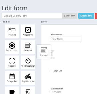
Efficient software minimizes clicks to perform functions. For instance, programmers designed ZenduOne – Work forms to be efficient because users create forms by dragging icons instead of by typing codes.
Engaging software are ones that make people say, “Wow, this looks clean and pretty!”.
Error tolerant are software that avoids crashes and bugs. In addition, because bugs and crashes are inevitable in the software world, error tolerant software help users recover. To illustrate, look at Microsoft Excel. Excel helps users correct formula mistakes by offering suggestions.
Easy-to-learn software are programs that are quickly learnable and retainable. For instance, ZenduMA has a “Show Video Help” button on every screen and teaches users how to use maintenance functions.
How do you make an easy-to-use app?
So, how exactly do programmers implement the 5Es and create easy-to-use apps? The short answer is a lot of work, a lot of opinion gathering, and a lot of revisions!
One of the best practices is doing Usability Testing. Usability Testing involves gathering users and collecting their reactions to an app.
Case Study – App Testing
Recently, I got to see a live example of Usability Testing. One of our project managers was testing an app and invited me to watch his process.
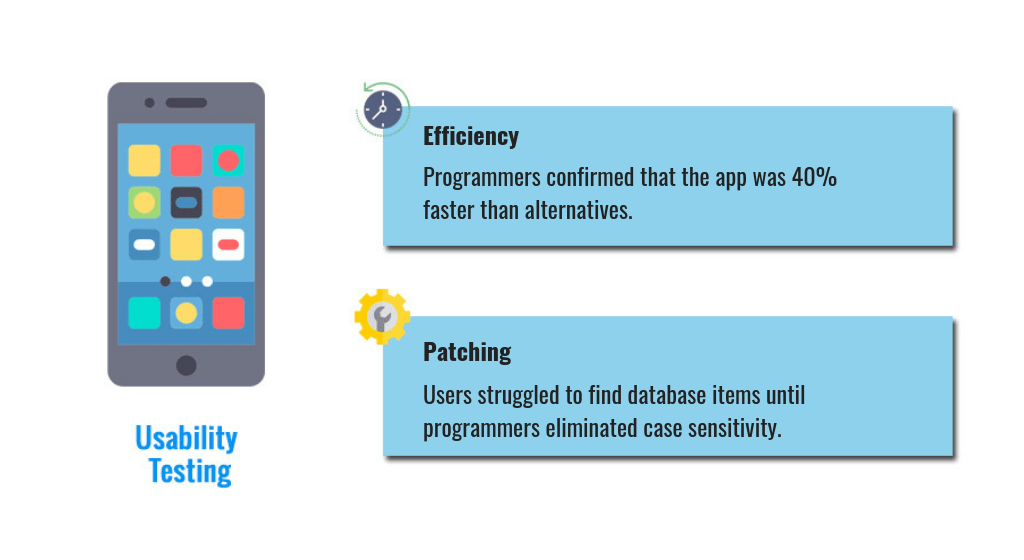
Together, we noticed that users were spending 40% less time to do tasks on our app versus alternative apps. However, one issue was that some users disliked the search function because the search field was case-sensitive. As a result, they couldn’t find certain database items.
That was useful feedback because the programming team worked on an app update to eliminate case sensitivity. As a result, the Usability Testing improved the app’s error tolerance.
Check out another article where we discuss usability on web platforms here!


